Thanks for you answer, Ori.
While some of the things you‘ve mentioned are “right” in terms of technical characteristics, I think the point of view from whom we both started our arguments are quite different.
Ori Redler wrote:
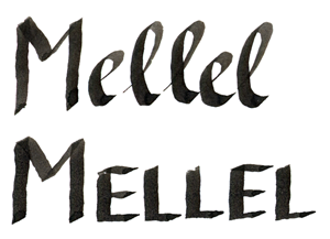
A. Bad-bad apostrophe: The apostrophe looks bad because it looks bad. It looks bad in TextEdit:
And in Mellel:
It’s not that I don’t like the apostrophe itself, I think it is quite O.K. but what I liked to show on my example above is the bigger size of the apostrophe if it is used with your OpenType/FakeSmallCaps option.
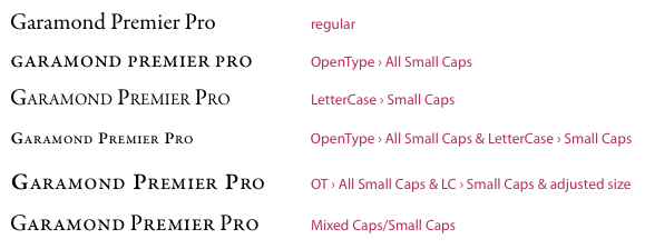
Here’s another picture:
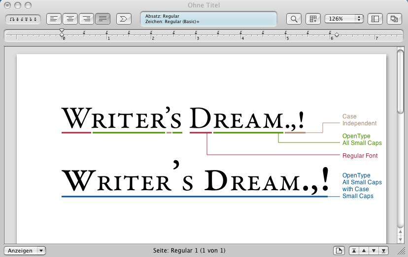
The options I’ve applied to the text are highlighted inside the picture. Both examples have been prepared in Mellel and the first one is what you’ll get in TextEdit if you choose “Small Capitals” while all the characters are selected. In this case, the UpperCase letters stay the same as all the punctuation marks do.
Because one have to compensate the size of the OpenType/FakeSmallCaps option you’ve suggested, not only the letters were scaled up but also punctuation marks, and that’s what I think looks terrible. If I have to apply your hack only to letters but not punctuation marks, I also could select only the lowercase letters an apply the OpenType/All Small Caps option (if this is applied to the punctuation marks, they won’t change.)
This is not only important if you like to use SmallCaps for a headline but even more, if you use SmallCaps as an inline style attribute as you could do with an italic font face.
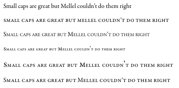
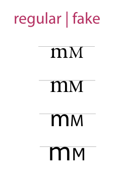
Let’s look at one more picture:
The first line shows the sentence in mixed case. If I now like to display the Author’s name in Small Caps, it should look like the example in line 3. Line 2, however shows the result how it will look with the OpenType/FakeSmallCaps hack. Not only the upper case letters stand out of the overall appearance but also the dot after M. and the apostrophe are bigger than they should be (and are in the surrounding text). So there’s something wrong.
Ori Redler wrote:
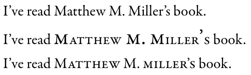
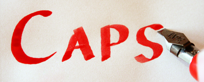
Regarding the "bold" appearance: this is a mirage. For example, let's take this example:

The text as Mellel lays it out clearly seem bolder, especially when we compare the two "L"s there.
Now, let's do some controlling of this by equalising the height of the "L"s in both samples:

As you can see, the "L"s in Mellel are identical, whereas with the regular setting for this the small caps "L" is in fact bolder -- Just the opposite of how it seems.
What you did here shows your way of thinking to me, but I wonder why you haven’t just looked at the results.
Small Caps aren’t neither scaled down Caps nor shouldn’t scaled up Small Caps used as Caps. Small Caps are just that, small (lowercase) letters with the
shape of the uppercase ones. They are their own thing as lowercase letters are.
No one (I know of) ever had the idea to write a sentence in Mixed Caps, then take the lowercase letters, scale them up until their height matches the uppercase ones only to say: “the lowercase w is wrong because if you scale it up to the size of the uppercase one, you clearly could see that it’s much too bold”
Even if this is true, it is so, becasue it intended. What printed type tries to achieve, is to reproduce the appearance of written style (more or less) in a perfect way. One characteristic of written text is that all letters (uppercase, lowercase, punctuation, superscript, subscript) feature the same width of the used pen (fountain pen, calligraphic pen, pencil, ball pen, brush…)
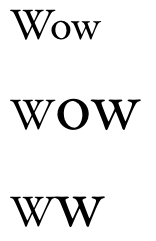
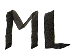
As you could see, I’ve written the word Mellel twice. One time with lowercase styled lowercase letters and a second time with uppercase styled lowercase letters. The stroke width is the same as I’ve used the same pen:
By doing this, the Small Caps look smooth and would integrate themselves just fine in any written text.
If I take a Small Caps L from the Mellel example above, scale it up so that it’s height is equal to the uppercase M, it’s very clear, that it’s stroke width is bolder because it's scaled up in any direction.
There’s nothing new about this.
I don’t know how you read a book. Do you cut out all letters, sort them by uppercase and lowercase, scale the lowercase ones up to match the height of the uppercase letters and combine the whole thing to a book again?
So why would you do this with your Small Caps example above?
In case I couldn’t express myself good enought, I’ve found a nice article about the use of Small Caps on creativepro.com
Back to Typographic Basics
Some sentence out of this:
Anemic Type
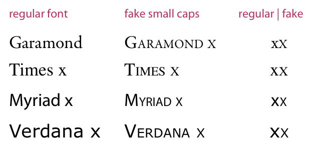
The other rude noise in the symphony hall that has become common is fake small caps. Small caps are wonderful things, very useful and sometimes elegant; fake small caps are a distraction and an abomination.
Fake caps are what you get when you use a program's "small caps" command. The software just shrinks the full-size capital letters down by a predetermined percentage – which gives you a bunch of small, spindly-looking caps all huddled together in the middle of the text. If the design calls for caps-and-small-caps – that is, small caps for most of the word but a full cap for the first letter – then it's even worse, since the full-size caps draw attention to themselves because they look so much heavier than the smaller caps next to them.[…]
I'd advise everyone to just forget about the "small caps" command -- forget it ever existed, and never, ever, touch it again. […] You don't really need small caps at all, in most typesetting situations; small caps are a typographic refinement, not a crutch.
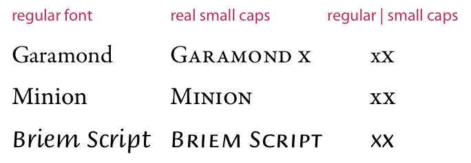
If you're going to use them, then use real small caps: properly designed letters with the form of caps but usually a little wider, only as tall as the x-height or a little taller, and with stroke weights that match the weight of the lowercase and the full caps of the same typeface. Make sure you're using a typeface that has true small caps, if you want small caps. And letterspace them a little, set them slightly loose, the same way you would (or at least should) with a word in all-caps; it makes the word much more readable.
The important thing is: “… and with stroke weights that match the weight of the lowercase and the full caps of the same typeface”.
Small caps are an silent style as italics are. If you read a book and keep reading on the left page, you won’t notice silent style on the right one. So you wouldn’t see if there’s a word written in italic or small caps. The thing’s you’ll notice (even if you don’t look at them direclty) are loud styles. bold is one of them, colors, differnt fonts and bigger sizes are some other.
Each one of them have their permissons as everyone could fulfill a specific task (highlight important things [bold, colors], identify new chapters [headlines]) but silent styles shouldn’t be an eye catcher.
Unfortunately fake small caps and the option suggested by you (OpenType/FakeSmallCaps) draw attention because the lowercase letters are too light (fake small caps) or the uppercase letters are to bold (the hack).
Both are bad because they look bad. And that’s why I’ve asked why you haven’t looked at the results. They don’t look nice and they won’t fit into any surrounding text. The bold uppercase M and L of your example
look like bold letters and bold is a loud style. They draw attention without any need. There’s not information hidden in the M or the L. The word (M
EL
LEL) would be split in seveal pieces and could not be read as [one] word again. It’s like if you speak a sentence to someone but shout very loud on every uppercase written letter. The listener probably couldn’t follow you any longer and even if – he will be highly irritated. The same is true for both fake small caps variations (even if those won’t be noticed in the same way as shouting people).
The thing that counts when it comes to typography is readabilty and appearance (both depend on each other). If something looks bad, it’s very likely that its readability also is bad.
Here’s some more citation from
Adobe’s OpenType User Guide where you could read about Small Caps (page 10) and All Small Caps (page 11):
Observe how these “faux” small caps look light and spindly next to the capitals, while the designed small caps match the appearance of their full-size siblings.
So the appearance is the important thing. The same is true for faked small caps. It doesn’t matter if they match the size of [insert your favorite Word Processor here] or if they match the size of the “other” lowercase letters. It’s important how they look when used alone and next to regular styled text and in this regard, they look ugly (which isn’t your fault as this is true for evey type of fake small caps, but it could be improved by making them slightly bigger to some level that makes their stroke width appear broader but still making them identifiable as small caps). I don’t vote for this as I haven’t voted for fake caps at all and I completely agree with the guy from creativepro.com:
I'd advise everyone to just forget about the "small caps" command – forget it ever existed, and never, ever, touch it again. […] ; small caps are a typographic refinement, not a crutch.
But that’s what Maria liked to say by writing “they are too small”.
Sorry for this long post (especially to modem users for excessive use of pictures) but I think it was necessary to explain some things.
The short version of this post has already been posted by transalpin:
transalpin wrote:What I’d love to see […] is the addition of an OpenType Small Caps option